

Learning Analytics in Higher Education: Improving Post-Exam Reporting and Student Success
Faculty often face an overwhelming amount of exam data—long reports, complex statistics, and limited insights into what really drives student success. In the Enflux panel discussion, “How KCU Built Actionable Post-Exam Reports with Enflux,” Felicia Graves, Data Lead for Exam Services and Analytics at Kansas City University College (KCU) of Osteopathic Medicine, shares how her team responds to exam challenges with a scalable reporting process.
She explains how data visualization improves collaboration, aligns assessment data with acurriculum goals, and supports student success. The interview highlights practical strategies such as building tiered reports for faculty and leadership, streamlining exam item tagging with the CompetencyGenie™.
Beyond manual exam reviews toward actionable insights
Enflux: Before implementing the new post-exam reports with Enflux, what did the exam review process look like at KCU’s College of Osteopathic Medicine?
Felicia Graves: Our exam review process is primarily managed through ExamSoft (by Turnitin) and involves a significant amount of manual work. After each exam, my team generates an item analysis, carefully reviewing questions to identify miskeys or poor performance. The report is then distributed to course directors, contributing faculty, and curriculum leaders. Together, we review flagged items, make score adjustments if necessary, and finalize results. Students receive a Strengths and Opportunities Report, but beyond that, the reports are archived until needed for remediation or course redesign.
Enflux: Can you describe the moment when you realized a change was needed in your reporting process?
Felicia Graves: That moment comes with an exam where results don’t align with our predicting data analytics and visualization. The data raised questions, but traditional item analysis couldn’t explain why. At KCU, we are deeply committed to our students’ success, so we needed a better way to understand what had happened and to prevent it in the future.
I began using Enflux’s dashboards and data visualizations for higher education more deeply, and that’s where we found the missing piece—the “whys” behind student performance. Faculty, curriculum leaders, and deans all wanted those visual insights, and Enflux delivered them in a clear, concise, and actionable way. When I shared the findings, the response was immediate: everyone valued the straightforward reporting and meaningful outcomes.
Since then, we’ve paired ExamSoft with Enflux. ExamSoft still provides granular item analysis, but Enflux adds academic dashboards and student success analytics that guide remediation, curriculum review, and decision-making. This combined process has become an invaluable part of our approach to learning analytics in higher education.
How academic dashboards transform item analysis into practical faculty guidance
Enflux: How do you present these reports to faculty and other stakeholders?
Felicia Graves: At KCU, we present reports in two formats: directly within the Enflux dashboards and as exported Excel files. This dual approach ensures accessibility—some faculty prefer the interactive dashboards, while others like spreadsheets.
Within the dashboards, the Assessment and Item Effectiveness Dashboard is especially valuable. It gives a percent-correct analysis by item and even includes a visual bell curve, which provides a quick snapshot of overall exam performance. Faculty who like numbers can dive into the data, while others benefit from visual trends.
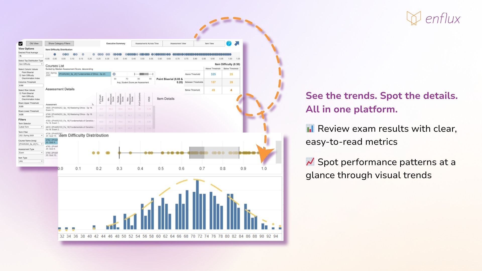
The Excel export is equally important. ExamSoft’s item analyses often run 30–50 pages, which can overwhelm busy faculty. Enflux simplifies this by showing all essential information—item ID, performance data, and a clear visual of student responses—on a single line. For example, you can immediately see that 59% answered correctly and 41% incorrectly, without needing to parse pages of statistics.
Enflux: How have faculty responded to these simplified reports?
Felicia Graves: The feedback has been overwhelmingly positive. Faculty now bring reports to review meetings on their own, pointing out flagged items and revising distractors or stems. Even those less comfortable with statistics are using the reports to improve their questions and strengthen assessments. Enflux has given them a practical, accessible data visualization and dashboards for higher education that empowers data-informed teaching and strengthens student performance across the curriculum.
Enflux: Beyond item analysis, what other insights can faculty gain from the Assessment and Item Effectiveness Dashboard?
Felicia Graves: The dashboard also provides Assessment Item Recommendations, which we typically export as Sheet 2 in our Excel reports. These offer straightforward, actionable suggestions for improving exam questions.
For example, if a distractor is never selected, the system might flag it with a note such as: “Distractor D was not selected. Consider making this distractor more effective.” These aren’t mandates, but practical recommendations to help faculty refine their questions so they perform better in future assessments.
Enflux: How do you adapt these recommendations for your faculty at KCU?
Felicia Graves: Just as we do with item analysis, we make small customizations to keep reports faculty-friendly. One of the most helpful additions is a lecturer column, which clearly identifies who authored each question. Faculty don’t have to cross-reference IDs—they can immediately focus on their own items.
The combination of clear recommendations and tailored formatting makes these reports highly usable. Instead of being weighed down by complex data, faculty receive practical, concise suggestions they can act on right away. Through learning analytics in higher education, academic teams can refine assessments and raise exam quality.
Strengthening curriculum mapping with an AI-powered tagging tool
Enflux: How does KCU approach tagging within your exam processes and how has Bloom’s Taxonomy with CompetencyGenie™ influenced your tagging process?
Felicia Graves: Exam tagging is one of the most frequently discussed subjects. At KCU, our Exam Services and Analytics team manages a bank of about 34,000 items in ExamSoft. While we act as caretakers, exam tagging is a collaborative process with faculty. From the beginning, we have worked closely with faculty to ensure consistency across every exam.
We use eight core tags on all items. You’ll only see seven listed in our documentation, but the eighth is the exam itself, embedded in the title. Before any exam is finalized, we verify that all tags are in place. This step is crucial because when an exam performs unexpectedly, those tags allow us to move beyond item IDs and look at categories. It helps us identify gaps, understand trends, and have more meaningful conversations about performance.
Bloom’s Taxonomy is a relatively new addition, and we’ve implemented it using Enflux’s CompetencyGenie™. This AI-powered tagging tool has been a valuable complement to our tagging work. For newer items, the eight core tags are usually already applied, but older questions sometimes carry excessive or outdated tags—sometimes as many as 18.
CompetencyGenie™ streamlines cleanup. While I remove redundant tags, the Genie runs in the background and generates its own recommendations. By the time I finish, its analysis is ready, and I can quickly add its suggestions. This “one-two punch” has been instrumental in improving consistency and expanding our curriculum map.
The CompetencyGenie™ doesn’t overwrite existing tags—it adds supplemental ones that faculty can review. Schools can compare their tagging to the AI’s suggestions, creating a validation process that improves accuracy and reduces ambiguity. Faculty no longer need to pause and wonder whether a question aligns with a standard—the AI provides that tagging automatically.
Consistent exam reporting as a driver of evidence-based teaching
Enflux: Felicia, you mentioned there’s one report you’re most excited about. Can you tell us more about that and how faculty use it?
Felicia Graves: Absolutely—my favorite is what we call Sheet 3: Category Performance. While it comes from a different dashboard than the first two reports, it’s worth the extra step. In the dashboard view, the data is color-coded for quick interpretation—blue for strengths, orange for areas showing vulnerability, and red for at-risk categories. This is where you start to see the connection between classroom instruction and exam outcomes. For us at KCU, this was the breakthrough report.
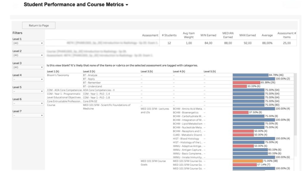
Student Performance and Course Metrics dashboard by Enflux
Exporting the report is surprisingly simple—I call it “magic in five clicks.” You select the course, choose the exam, and export the source table into Excel. The exported file is highly customizable. For instance, we redline at-risk areas so they stand out. If a course director sees that Goals 2, 6, 8, and 10 are flagged, that sparks immediate conversations about how to improve.
It also breaks performance down by the lecturer. One instructor might be consistently in the 90s, while another shows lower results. That context is invaluable—it helps identify where mentoring or additional support may be needed. Ultimately, the report drives meaningful dialogue. Directors and deans can pinpoint problem areas and collaborate with faculty on solutions. And as we’ve discussed, the quality of tagging is critical here—the better your tagging, the more actionable and insightful the data becomes.
Enflux: What kind of impact have these reports had on faculty engagement and leadership at KCU?
Felicia Graves: The biggest shift has been in faculty behavior. In the past, revisions often sounded like, “I hadn’t updated this question in a while, so I thought it was time.” Now we hear, “I changed this distractor because it was flagged in the Enflux report.” That intentionality—rooted in data—is transforming our academic culture. Faculty appreciate the transparency and use the reports to engage in ongoing, evidence-based conversations.
Enflux: Why is it so important to run these reports consistently, and what advice would you share with others looking to build a similar process?
Felicia Graves: Each report serves a unique purpose, and together they create a complete picture of student performance analytics:
- Sheet 1: Item Analysis – Simple and visual, providing a different lens from ExamSoft’s long reports.
- Sheet 2: Assessment Recommendations – Concise, actionable feedback to strengthen exam questions.
- Sheet 3: Category Performance – The “bread and butter,” tying classroom instruction directly to exam outcomes.
Instead of a 100-page document, faculty get a three-page report with everything they need. That efficiency is what makes it so powerful. My advice for others: keep the layout simple, clear, and visual. Highlight key correlations between lecture content and exam performance. When faculty see those connections, it builds transparency, sparks collaboration, and ultimately strengthens both teaching and student success.
Transforming exam reviews into meaningful academic change requires more than item analysis. With Enflux, KCU shows how student success analytics, academic dashboards, and CompetencyGenie™ create simple, faculty-friendly reports that drive collaboration, strengthen curriculum mapping, and connect classroom instruction to exam outcomes. This approach empowers faculty to make data-informed decisions with confidence.
Turn exam data into actionable insights
Support faculty, strengthen curriculum, and improve student performance with Enflux dashboards.